
Quick Summary
B Lab, the international non-profit organization best known for its B Corporation certification program, has a directory that allows users to look up B Corps. For this unsolicited project, I conducted user research to discover the habits and goals of ethical shoppers and business owners, then attempted to design more useful, usable, pleasing experiences for browsing and searching through the database.
Methods
- Competitive review
- Affinity diagramming
- Kano analysis
- Prospective user survey
- Personas
- Rapid sketching
- Wireframing
Tools
- Figma
- Sketch
- OmniGraffle
- Google Forms
- Pens, notebooks, post-its, whiteboards, etc.
Products
- Screens for browsing and searching the B Corp directory, with user-focused features like being able to sort by score and filter by specific pledges
Outcomes
- Shared with B Lab (currently waiting to hear their thoughts)
- Successfully taught myself the basics of Figma
Introduction
B Lab’s mission of “using business as a force for good” by encouraging companies to “meet the highest standards of verified social and environmental performance, transparency, and accountability” has historically focused on creating their criteria for B Corp certification, persuading businesses to pursue the certification, administering the qualifying assessment, and periodically conducting reassessment on every certification holder to ensure that standards are maintained. Their hard work has earned them a reputation as the gold standard for third-party ethical certification across industries.
However, they’ve done relatively little to help consumers find and shop with the companies that earn their coveted certification:
- Shoppers can look for an identifiable seal on the products, marketing materials, and websites of companies that earn the B Corp certification, but finding one doesn’t help with finding others. It also doesn’t help with filtering out non-B Corp competitors.
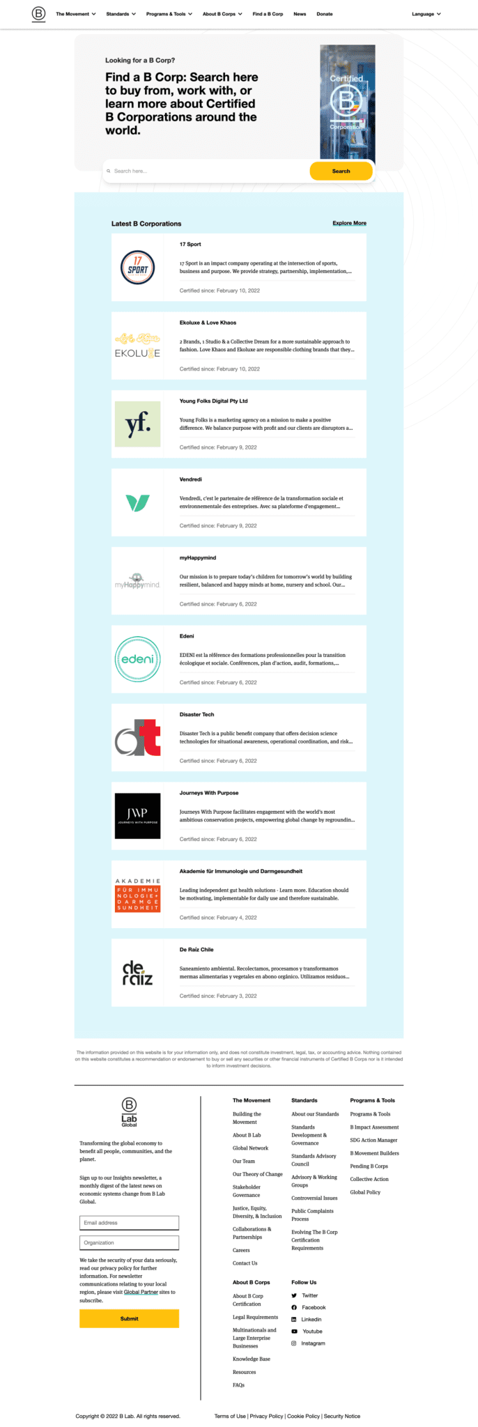
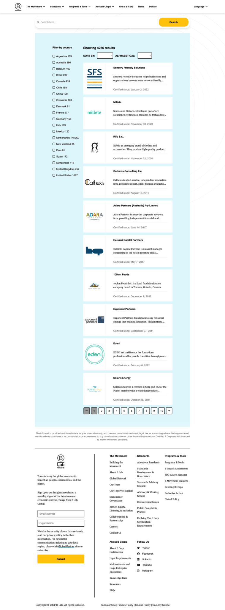
- The B Corporation website has a directory that shoppers can use to look up certified businesses, but it isn’t designed to help consumers during the actual process of shopping.
The seal that Certified B Corps are allowed to display on their products and websites.
By doing more to help consumers by designing according to their goals, B Lab could increase both the commercial value and ethical impact of B Corp certification. My project will use the Double Diamond human-centered design framework (discover, define, develop, deliver) to generate and refine concepts that will serve that purpose, and will use equity-focused design methods to ensure accessibility for historically neglected demographics.
Discover
What is the current situation? What are the problems and opportunities? What do I need to find out for the design goals to emerge? Do my assumptions match reality?
Client Review
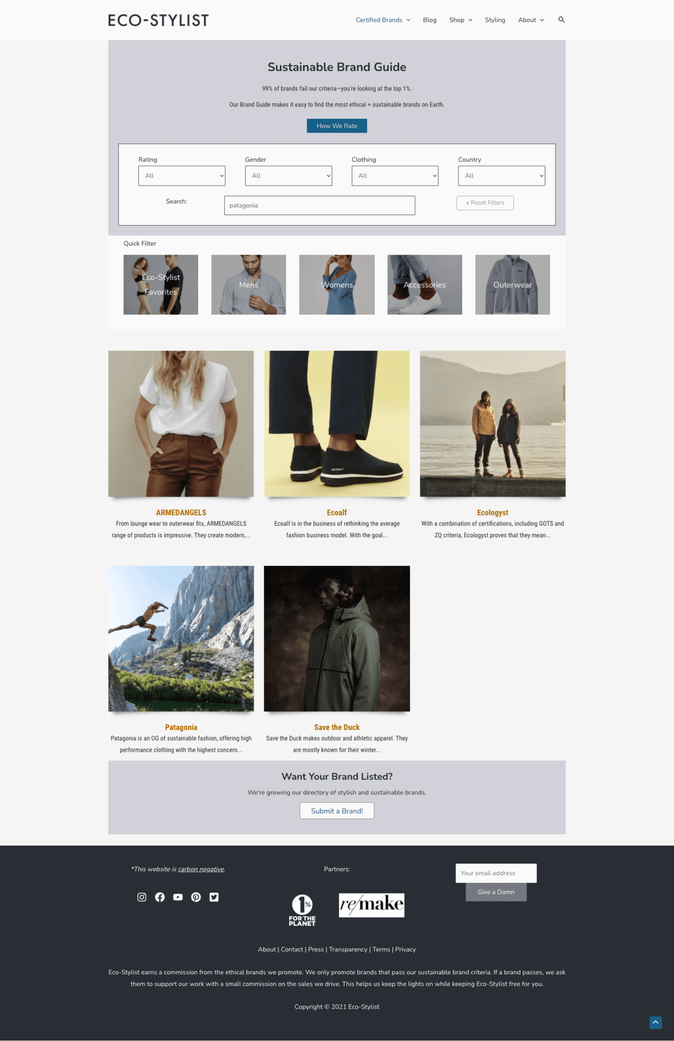
I began by taking stock of the directory in its current form. By coincidence, they rolled out a significant redesign during the project. It was interesting to see what they put their attention toward.
After making my affinity diagram in Phase 2, I returned to make another examination. I wanted to see how well the site's features supported the goals and concerns of the ethical shoppers I surveyed at the end of Phase 1.
Competitive Review
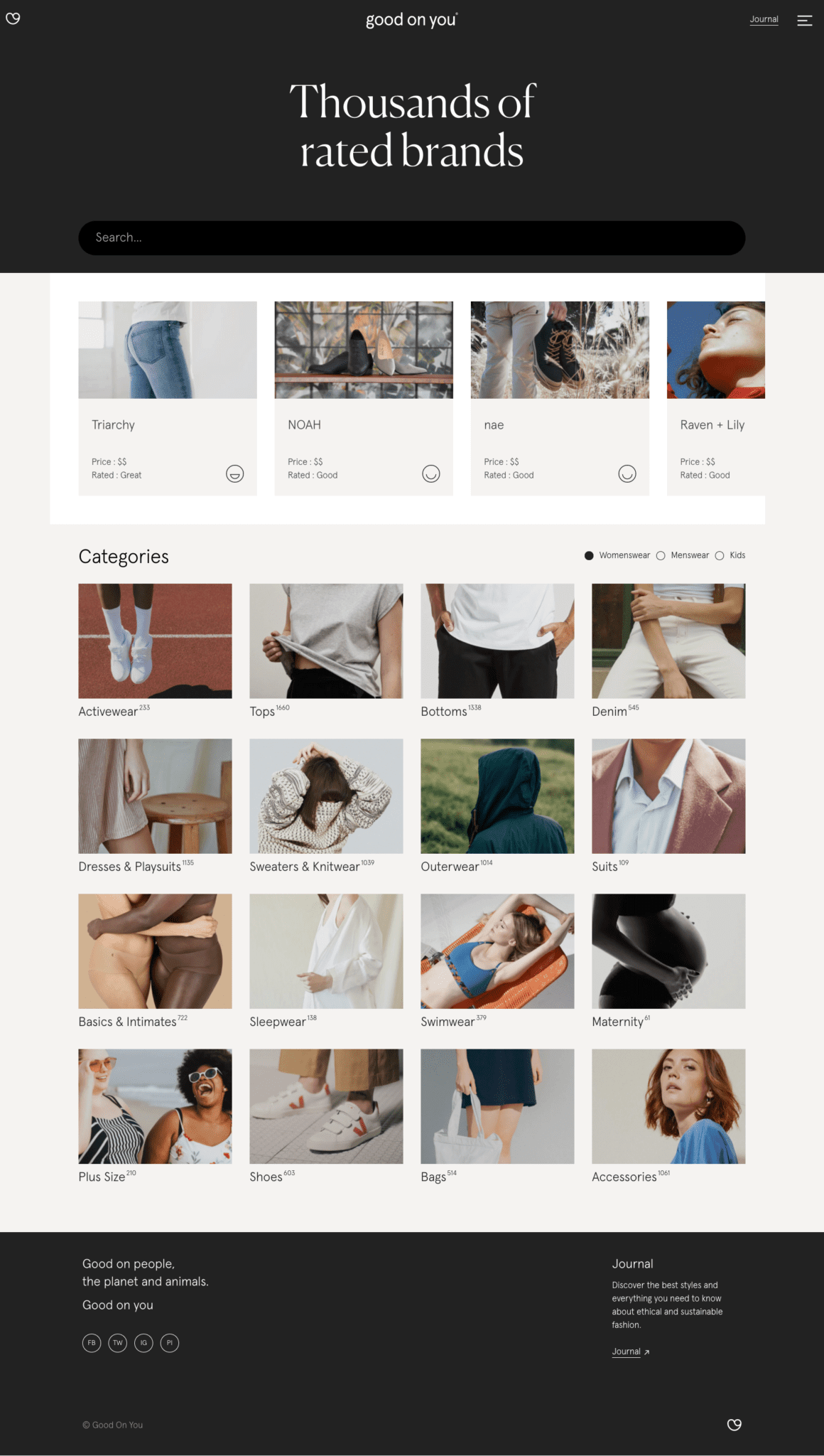
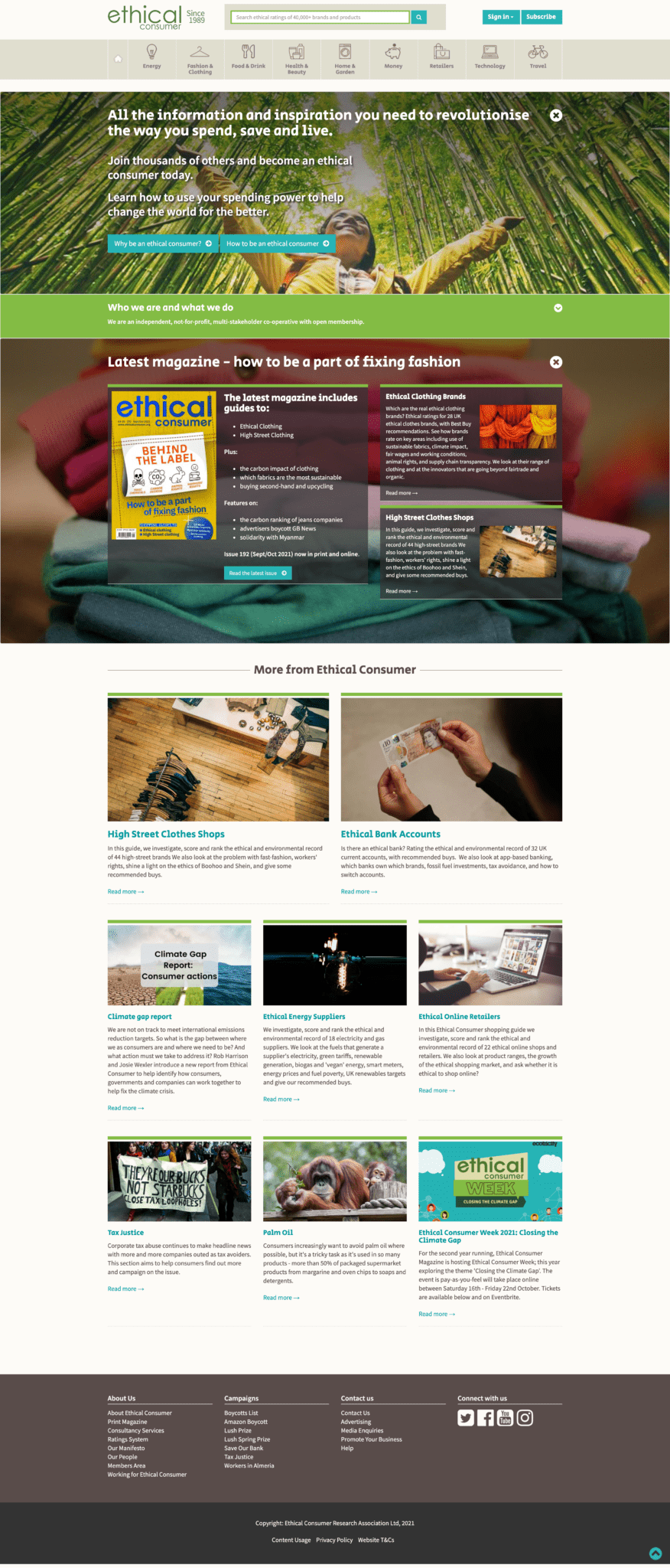
I also looked at other websites in the same sphere of intent. This included other third-party ethical certification organizations and ethical shopping review websites.
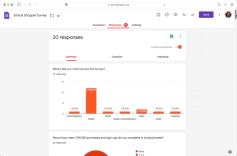
Prospective User Survey
I created a survey using Google Forms and shared it with a large ethical shopping community on Reddit. With more resources and time, I would've liked to survey and interview more groups of people, but I feel that I got enough responses for design goals to start emerging.
Define
Who will I be designing for? What do they care about and what is their behavior? What are some different features I could explore to serve their goals?
Affinity Diagram
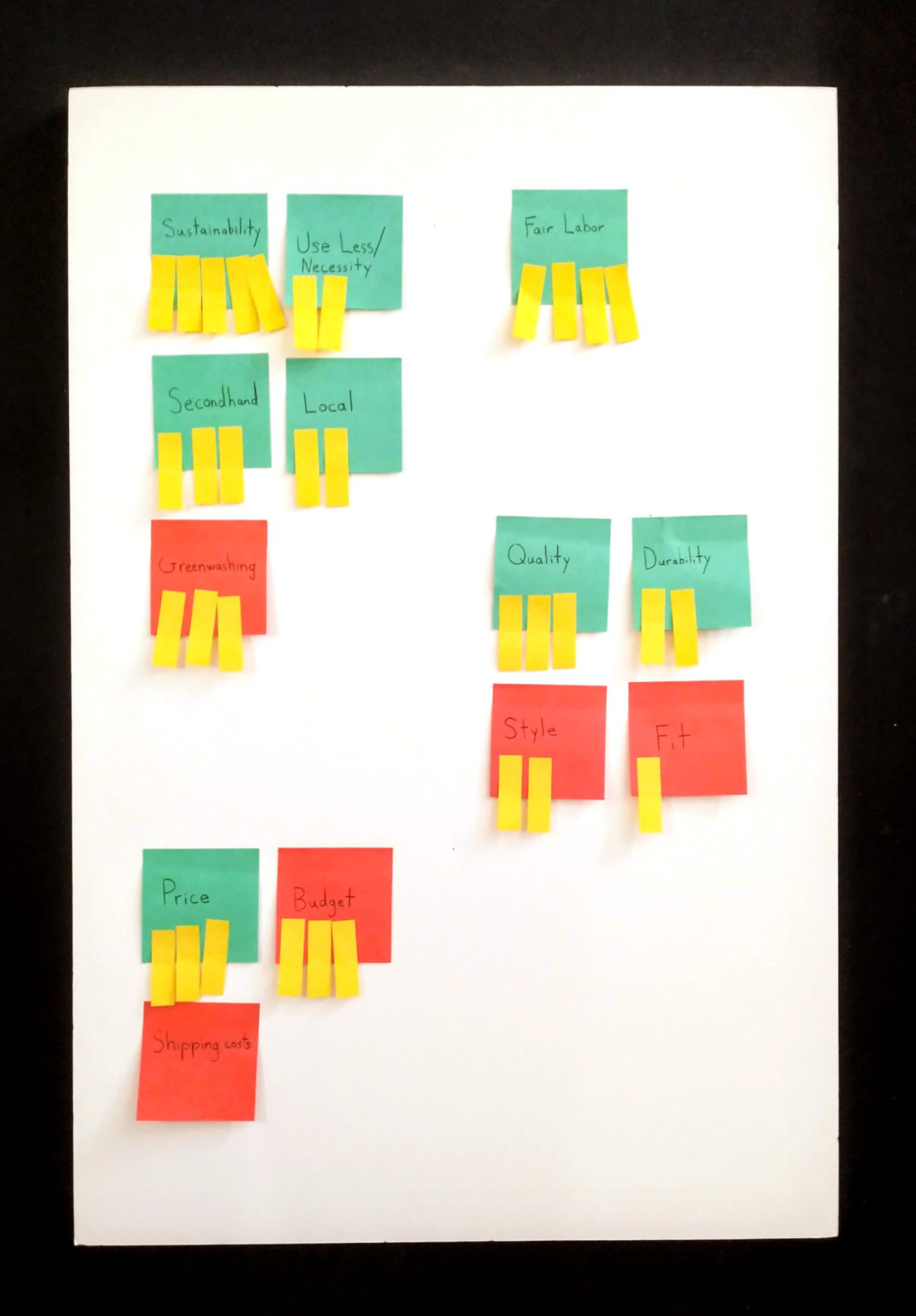
I combed through the survey responses to see what things they cared about most, put them into groups, and then added tabs to give an approximate of how often each goal/concern came up. This helped me check my assumptions about what actually matters to the people I'm designing for.
Kano Analysis
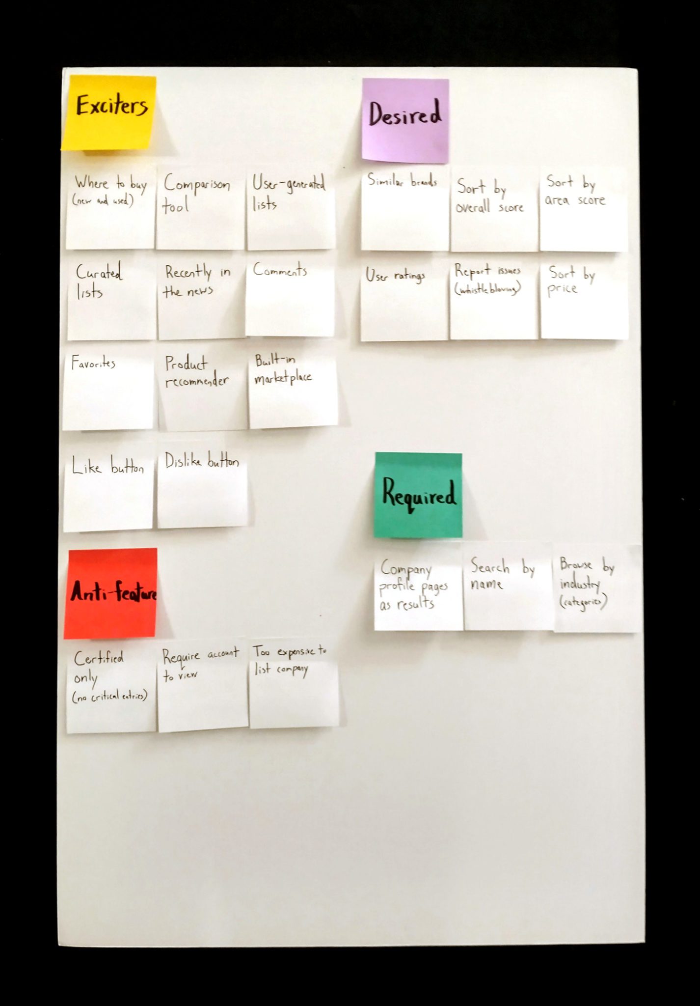
Based on the affinity diagram, I started brainstorming what sorts of things would satisfy the goals and concerns I found. I put them in Kano categories as I went. After making the personas, I returned to move and add new items (e.g. “That's a cool idea, but what does Erin want?” and “How will that affect Nick?”).
Personas


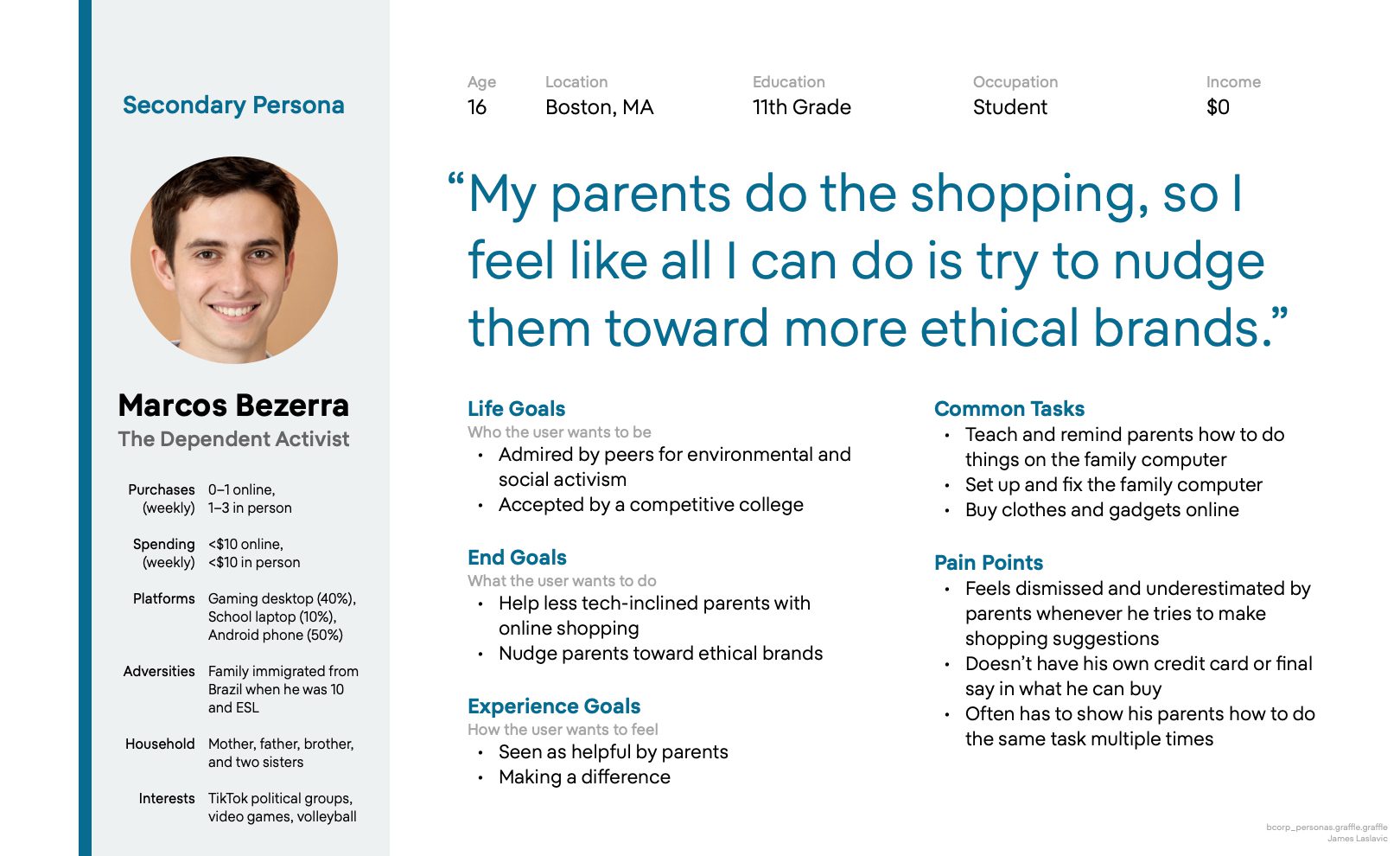

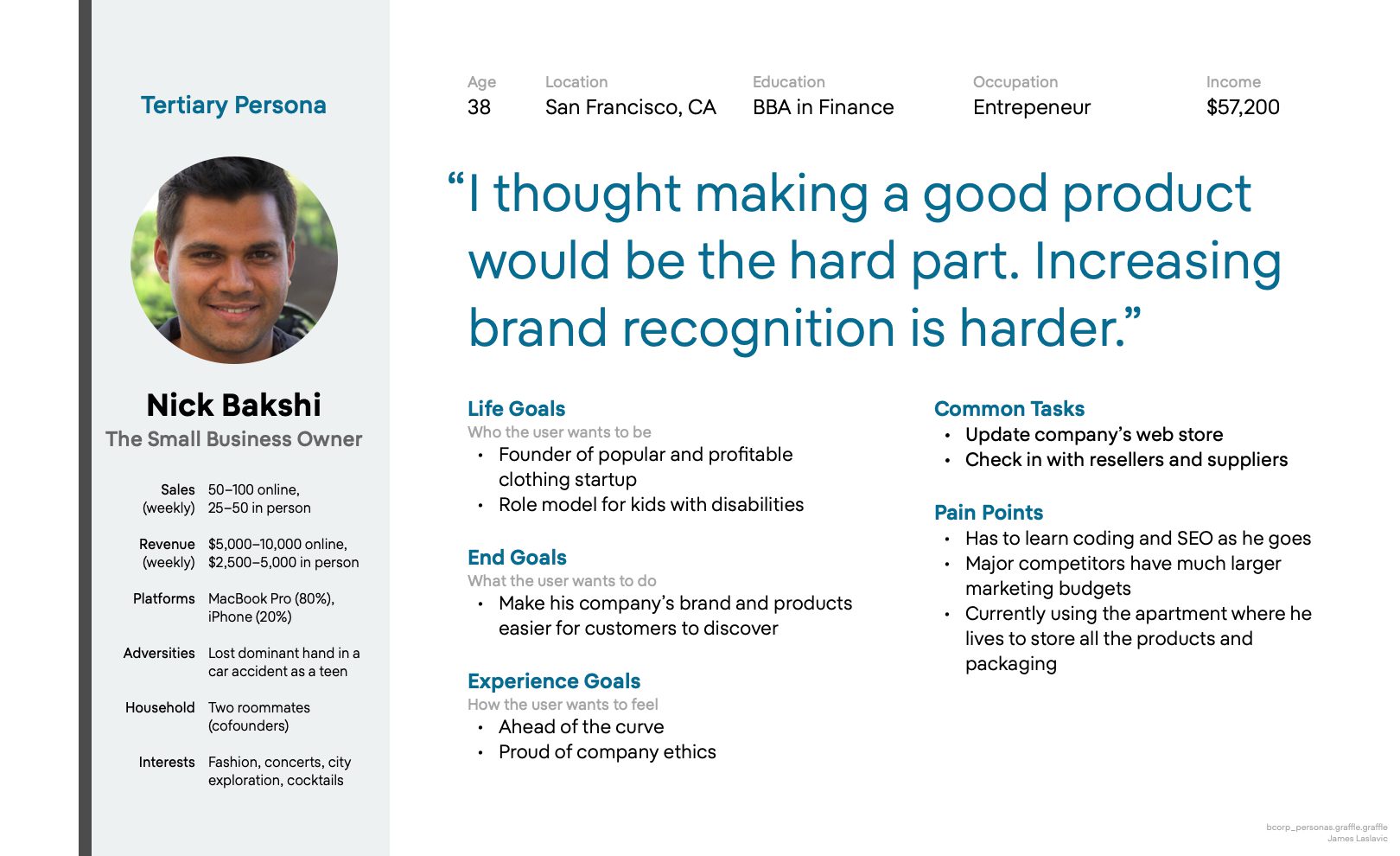
I created these personas in OmniGraffle 7 based on my findings from the survey, but I didn't make them by copying any answers from survey responses. Instead, I created them to approximately represent the groups I saw by using my affinity diagramm.
To practice equity-focused design, I deliberately added special factors for each persona to ensure that I'd consider the goals and requirements of historically neglected groups (e.g. “If Juliana doesn't feel like switching to the Portuguese language version of the website, how cognitively demanding will it be?”).
Develop
Which features would make the biggest positive impact for the goals of my personas? What are some different ways I could help them accomplish their goals?
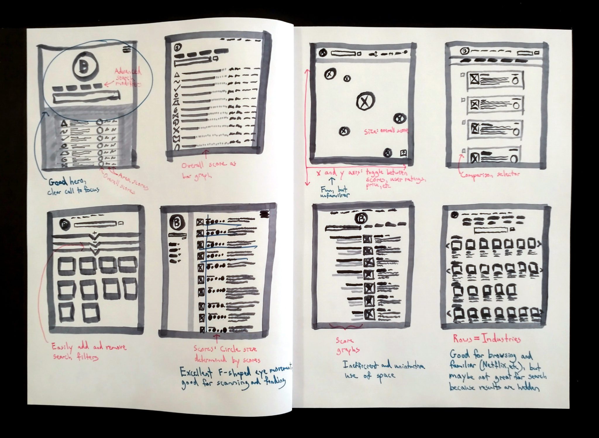
Rapid Sketches
Now that I had an understanding of the goals of my target users and ideas about the sorts of features that would help those goals, I started sketching different layouts that incorporated those ideas.
On my sketches, I use a magenta pen for explanatory notes and a turquoise pen for self-critique.
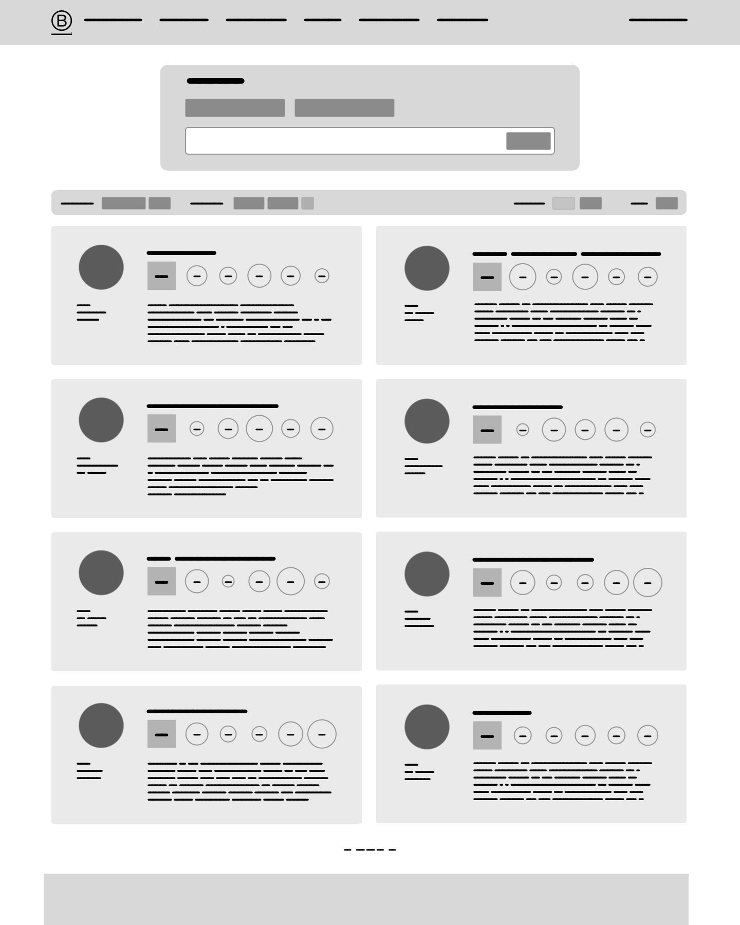
Wireframes
I took what I felt were the most promising ideas from my sketches and made some low-fidelity wireframes to get a better idea of how everything would need to fit together.
Something I experimented with was a typeface called Flow. I felt like it helped me generate and manipulate the wireframe layouts faster, but I'm not sure if I'll use it in the future because it didn't help with getting a sense of how big I needed to make text in order to be legible.

Deliver
Out of the concepts I explored, which are the most feasible and desirable? How should I combine and refine them? What should I set aside?
Mockups
Finally, I used Figma to make high-resolution mockups based on the wireframes. I tried to stick with B Lab's current branding as much as possible. For instance, I rebuilt their website's navigation bar and footer instead of making one up.
Since I'd never used it before, part of why I did this project in the first place was to figure out Figma. I found it very similar to Sketch and OmniGraffle, but with extra capabilities that I used to wish those programs had. I can see why it has become so popular in recent years!
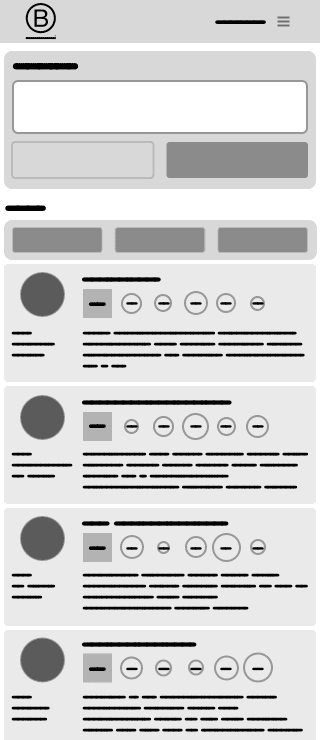
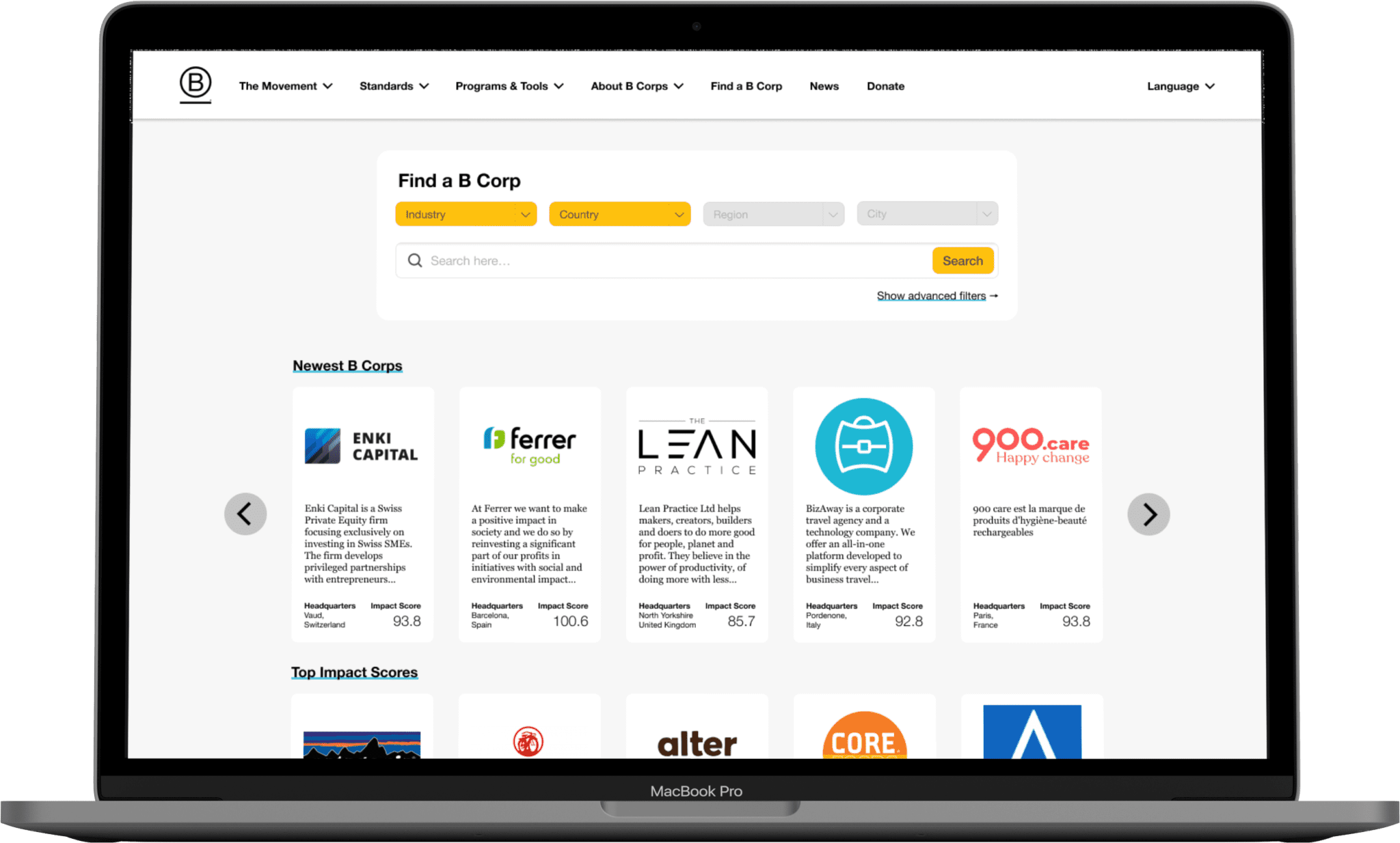
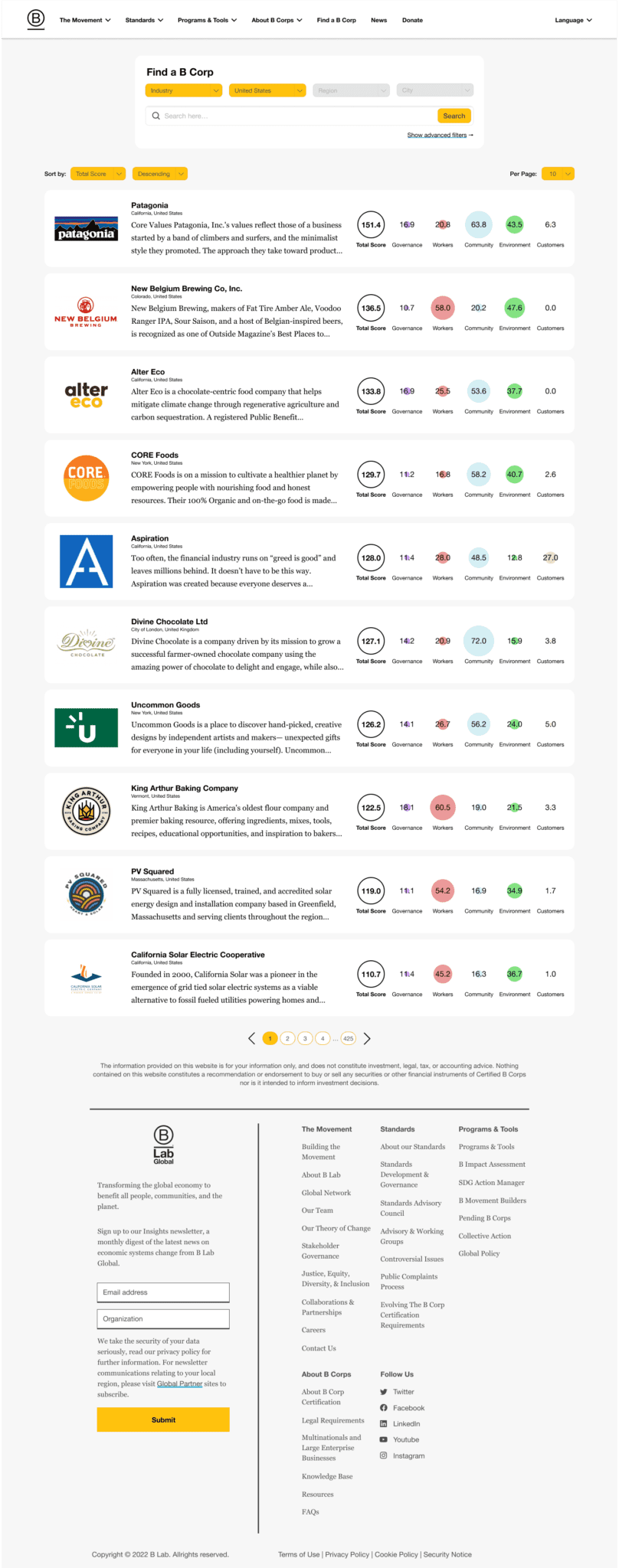
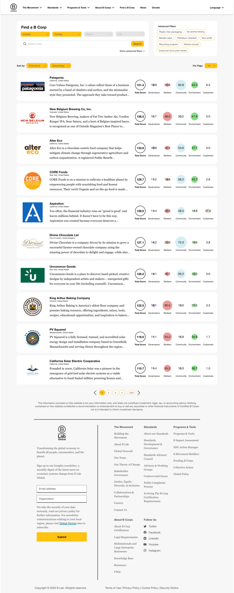
Browse
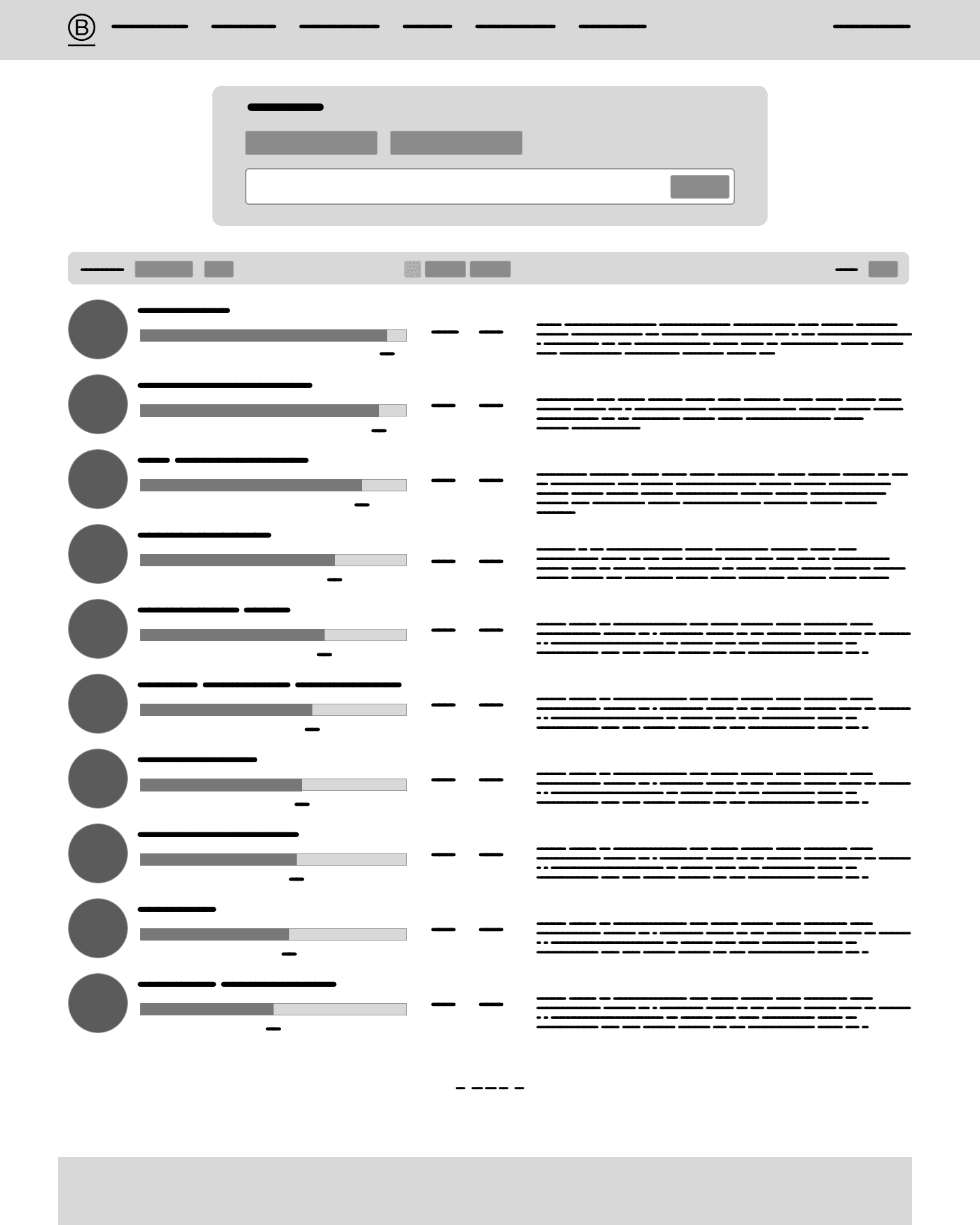
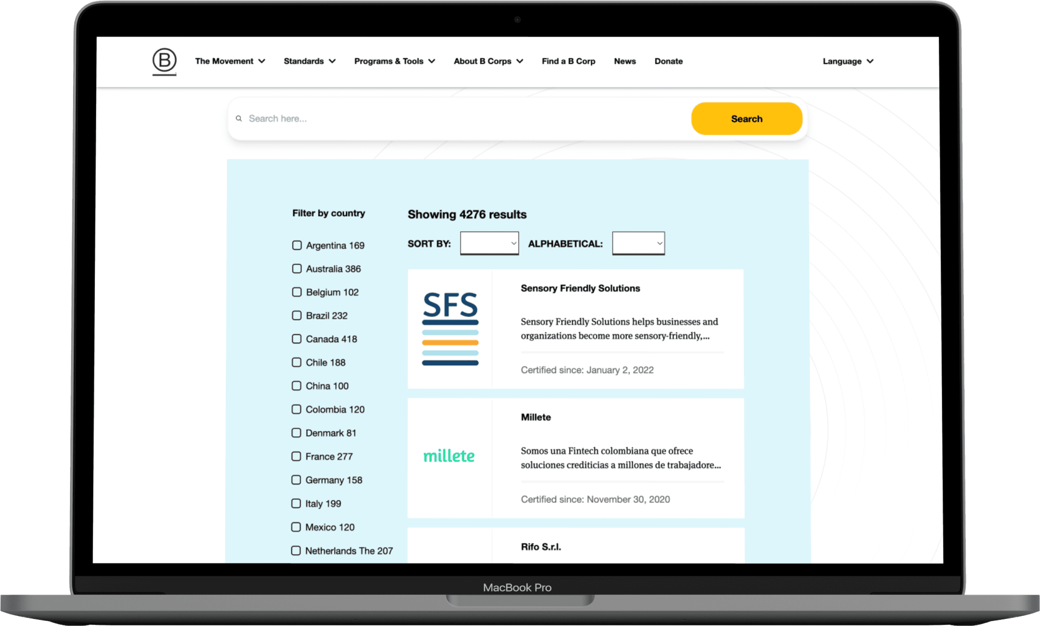
Search
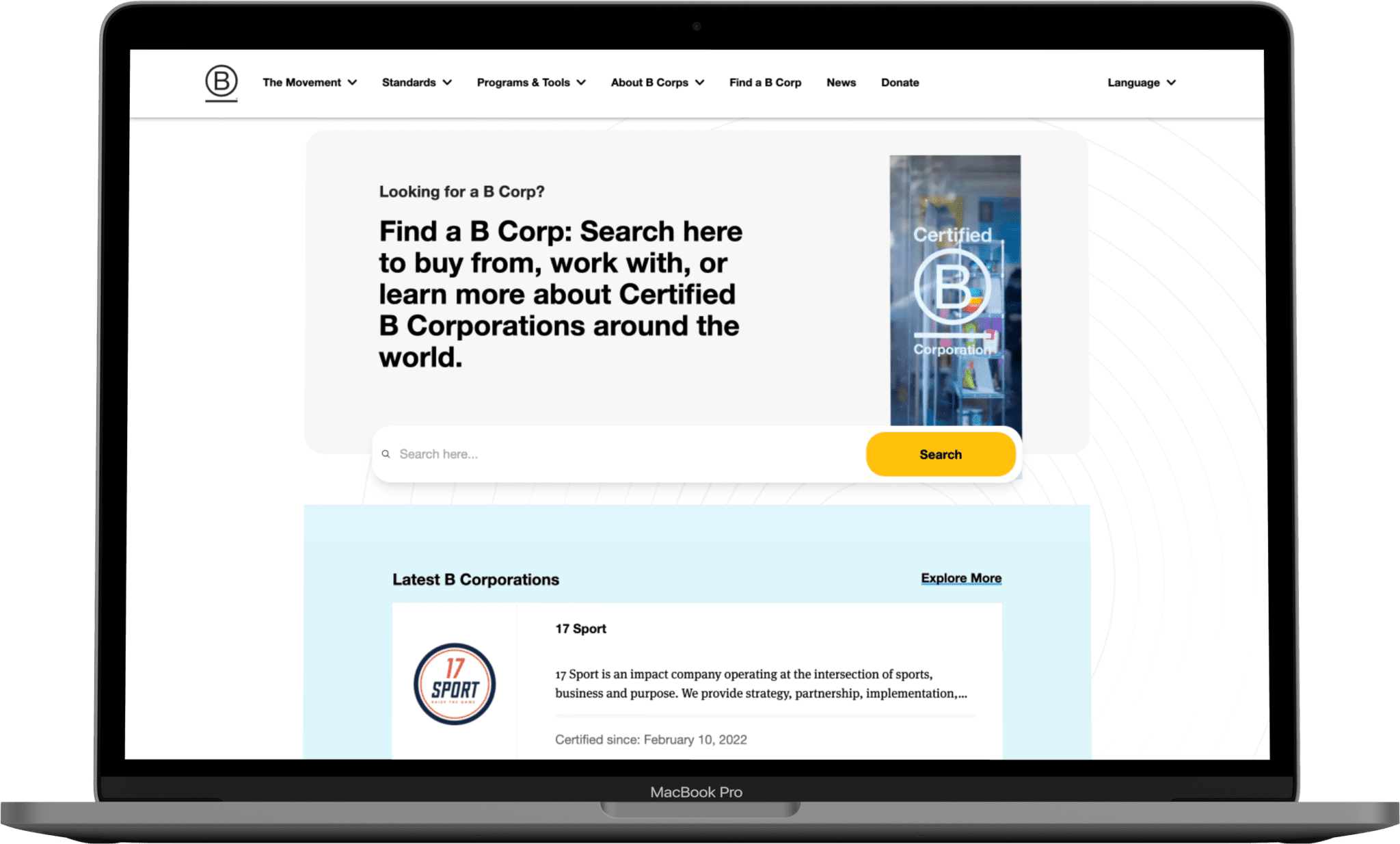
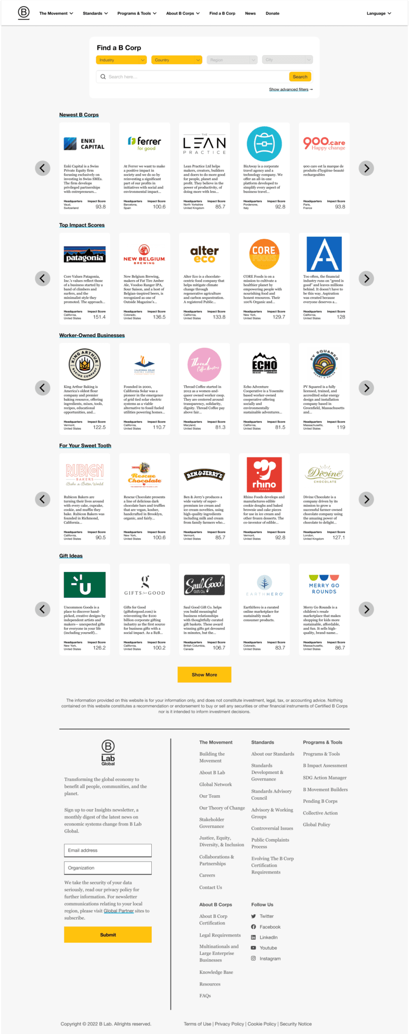
Browse screen on page load.
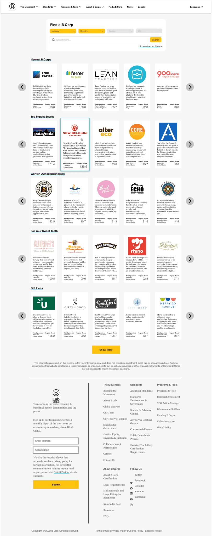
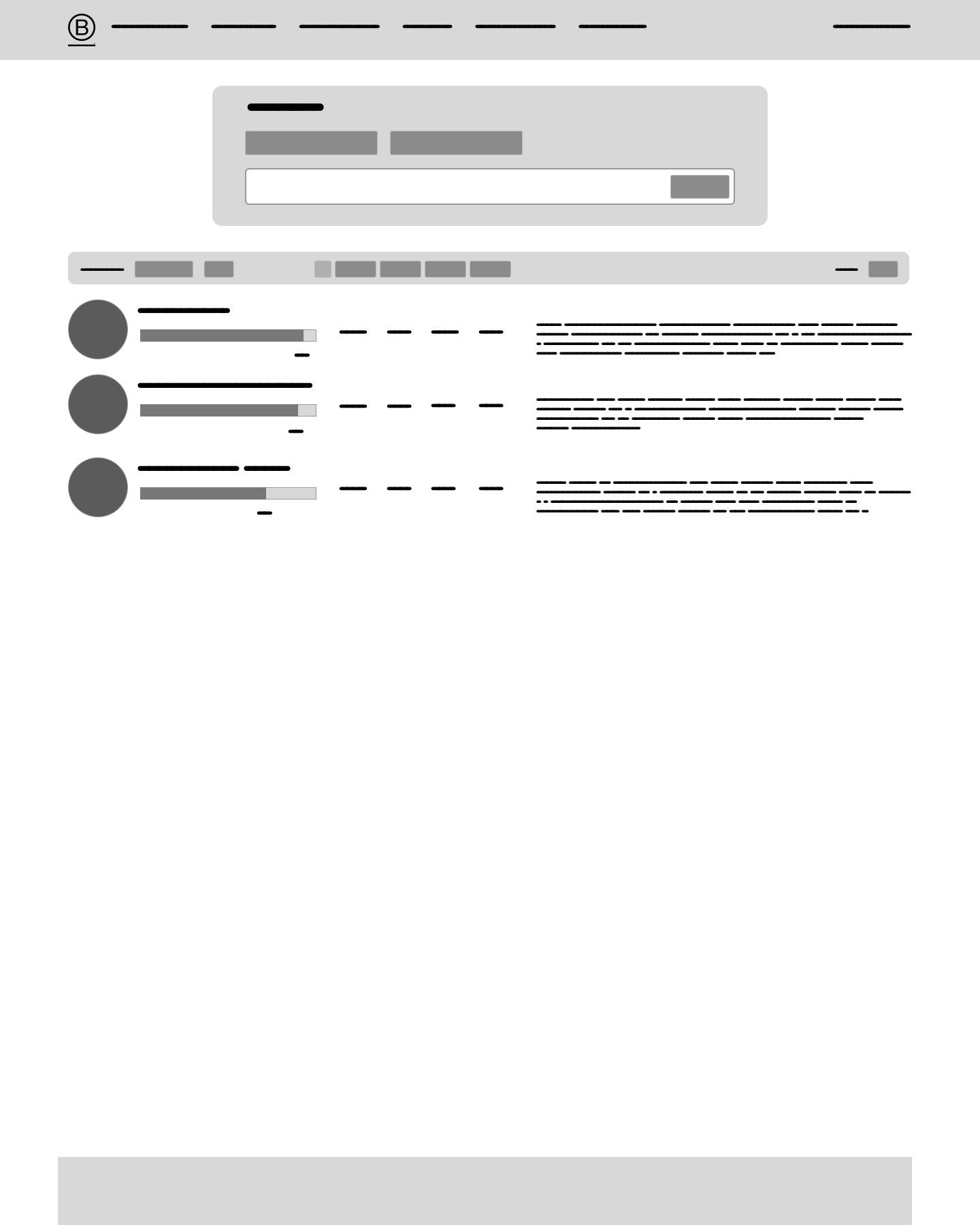
Hovering over a card.
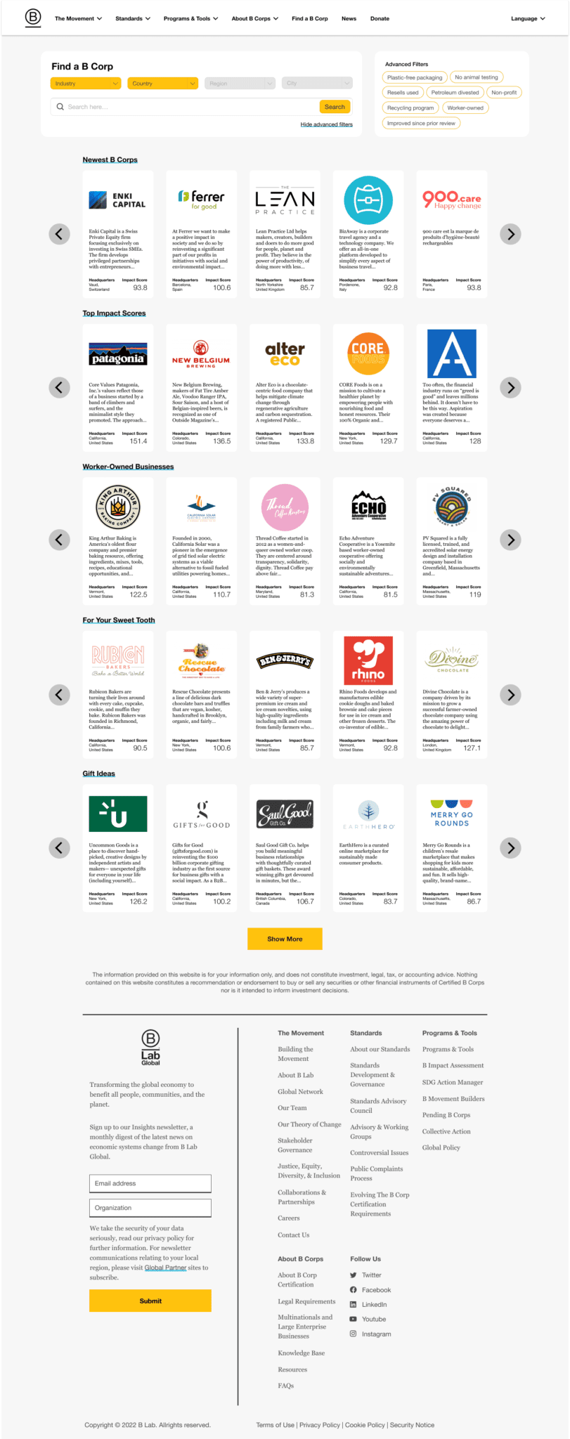
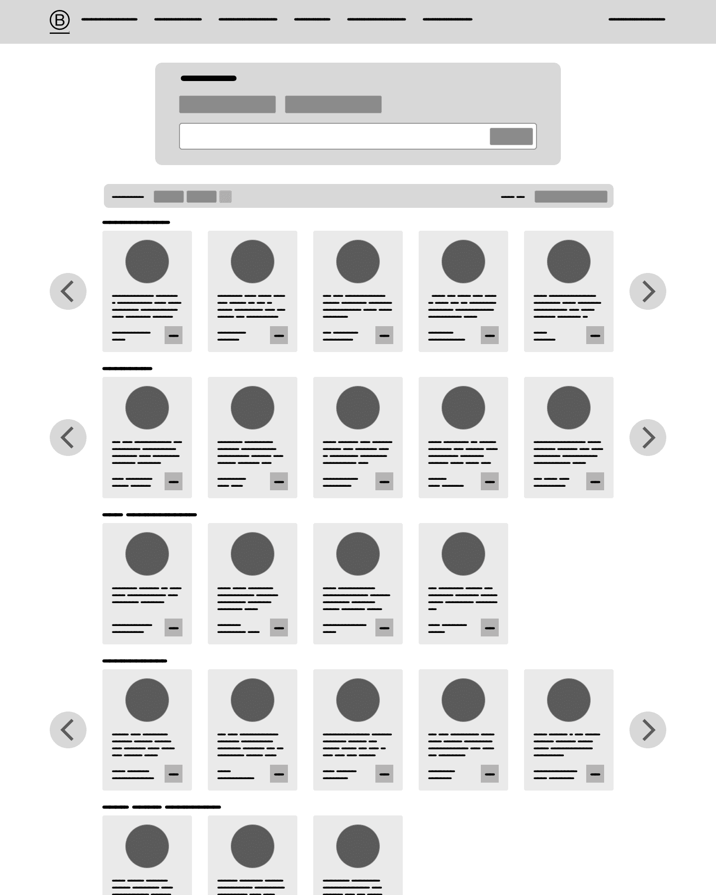
Using the advanced filters on the browse screen.
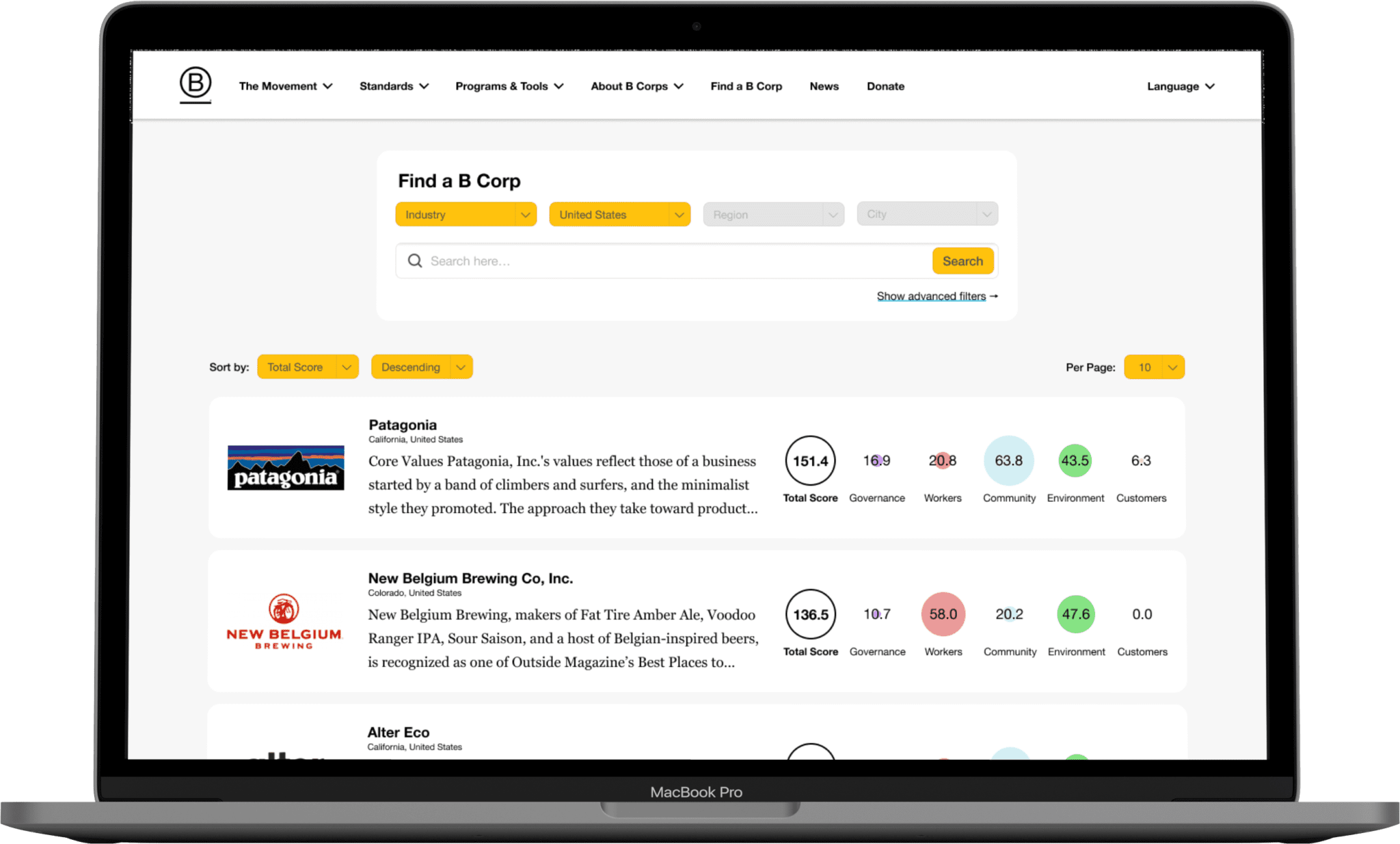
Search screen on page load.
Using the advanced filters on the search screen.
A small business owner is happy to see how much easier it is for customers to come across his business now that it appears in relevant short lists.
An ethical shopper is delighted by how easy it is to see where companies are strong and where they have room for improvement right in the directory's search results.
Next Steps
The first thing I'll do is share my findings and designs with B Lab, and hopefully they'll give me their thoughts. Because this project was done so recently, I haven't heard back yet.
If I had actually been hired or assigned to work on a redesign of the B Corp directory, then my immediate next step would probably be to print out the mockups to make some paper prototypes. I'd create a list of tasks and ask users (one-on-one) to walk me through how they'd execute them on website, using the paper prototypes as references. Based on the paper prototype feedback, I might go back to sketching, wireframing, or adjusting mockups (assuming the findings weren't catastrophic enough to warrant going back even earlier).
Conclusion
The biggest reason I decided to make a redesign of the B Corp directory is because I think it's an underappreciated, underutilized resource for anyone who wants to shop more ethically. I verified my hunches about some low-hanging fruit that I think B Lab is missing (e.g. the ability to sort the B Corps by their scores), and discovered some priorities that I'd overlooked until conducting my own user research (e.g. interest in shopping used/refurbished when possible). I plan to share my findings and my designs with B Lab, and I hope they find it useful.
Think I might be a good fit for your team?